How to Take Product Photos With Your Phone
If you've been wondering how to take product photos with your phone...or if it's even a good idea, you're in the right place!
Never has their been a more convenient time than today where you can shop online with instant gratification. Think about it. You can pull your phone from your pocket RIGHT NOW, see a photo with a price tag, click buy, and very often, you can have that item in hand the very same day without ever having to get your tush off the couch ;).
Kind of crazy when you think about it, right? With that in mind, think about how important it is to stand out visually when that customer who is sitting so cozily on their couch is scrolling through a sea of product images online, deciding which business is going to get their money today.
I hope that puts things into perspective :)
When you're bootstrapping your craft business and just trying to get up and running, selling your crafts online, the last thing you're probably thinking about is investing in an expensive camera for your photos.
But the fact is, while having snazzy camera equipment might be nice, you can get some pretty amazing product photos these days with little more than a smartphone and some good lighting (natural light counts!).
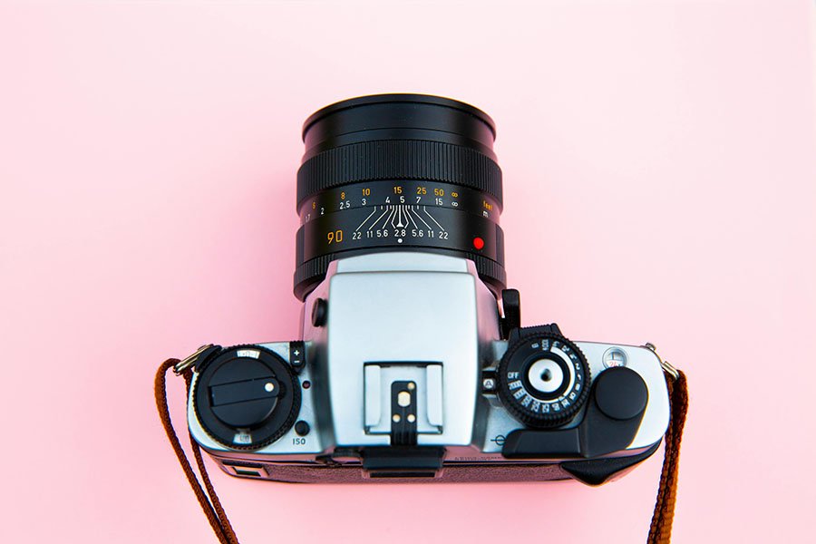
Using your phone to take photos of your crafts for your online shop is not only cost effective, it can save you time as well. You can skip over the lengthy learning curve of complicated devices with their apertures, ISO, and F-stops (what? see what I mean?!).
You have everything you need in front of you to take photos with your phone right now, so let's talk about how to embrace simplicity and take some click-worthy pictures with the product photography tips below!
Why Good Product Photography Matters
Let's return to that image of your customer on their couch at home, scrolling through their phone, shopping online for a gift. As you know, many product markets are fully saturated.
For example, a quick search for the words 'lavender scented candle' turns up hundreds of pages of Google results! Even searching for something a little more obscure like 'hand painted floral tea set' still turns up the same amount of search results. And it will bring up just as many images. That's a lot of competition!
This is a huge reason in itself to put some time and effort into taking professional product photos. When designing and curating your online store, remember that your product photography is part of your business' branding. Haven’t figured this out yet? Check out my branding for creative entrepreneurs checklist!.
Staying consistent with your brand's imagery through your photos will consequently enhance your overall brand image, attract more customers, and get you more sales. It also makes you look like you have your 'stuff' together, and shows that you are a legit online business! (You know those shady looking websites where you're not sure if you'll actually ever receive the product? Yeah, don't be like that...).
In general, the better your photos are, the better your chance of making a sale. You should know that 'a confused mind never buys', and if your shoppers are confused about your products or not getting the full picture when looking at your product photos, then that is definitely working against you!
Setting Up Your Home Studio
If you're new to DIY product photography, it's usually pretty simple to get started (depending what you're shooting!) Think about the types of products you'll need to photograph. Do you need a lot of space? Will you need a tabletop? Shooting outdoors?
Think about your branding next - what's the vibe? Does it call for natural light? Or maybe a brightly colored background? Or an interesting, shadowy set up? Choose accordingly.
When setting up a home photography studio, most products are best captured in natural light so your potential customer can get a clear visual of the size, shape, color, and texture of your product.
To create a simple yet effective set up to shoot in natural light, find your nearest window...but not so fast! It might take a day or two to get it right, but it's worth mentioning that not all natural light is created equal.
Depending on which direction your window is facing and what time of day it is, your window could be giving you either piercingly bright direct sunlight, a shady mess, or soft shadows.
To test what time of day is best for the effect you want to create, place your product in the window and shoot it every few hours to see how it comes out.
If you don't have a window available, or it's not working well for your set up, you can try shooting outside (although not ideal). Go through the same process of shooting at different hours of the day to see what time of day is the best for you.
Before resorting to outside photography, ask around to friends and family if they might let you take over a space in their house or shop for a few hours so you can get great photos in their light. It will be worth it!
Next you'll want to figure out your background and/or props. If you're new to creating online listings, you'll want to take different types of photos so your customer can experience a variety of different views of your product.
Etsy shop: Hannahbpottery
For example, props are great, but you'll want at least one photo of each product to be on a plain background with no props. That way your customer can see your product clearly on its own. Once you have that out of the way you can play with more fun and creative photos, using relevant props and items that show off your product.
Your props don't need to be anything crazy either! You can use household items to keep costs low and they'll look just as great! Just make sure that they are not distracting from your product too much in your photo. You want your product to be the star of the show!
One last thing to note is your background. Many creatives are using something as simple as a large piece of posterboard (white or color), or just a piece of fabric behind their products and with the right lighting, it can look amazingly professional! Don't overthink it.
Mastering Your Smartphone Camera
Ok, so let's jump into the nitty gritty...how to take product photos with your phone that actually look good! In my opinion, it's a 2 part equation.
The first part is at least getting a decent photo taken in the first place before the editing phase. You can have the best editing skills in the world, but if you only have a terrible dark and blurry photo to work with, you'll be fighting an uphill battle and wasting time.
The second part is knowing how to edit quickly and easily. I'm going to go over that in a bit, so right now let's focus first on getting a decent photo taken. I'd suggest taking these steps when taking your initial product photos:
1. Create the best physical lighting you can so you'll have to do less editing later.
This might mean walking around a space until you find a place that shows off your work the best, or using a reflector to bounce light from a far away window. Get creative here!
2. Take multiple photos from many angles, with and without props and different backgrounds.
Trust me, you'll thank me later - the more options you have when editing, the less chance you'll have to go back and re-shoot your photos later.
3. Check out your phone camera settings so you can make the most of your setup.
Here is one little trick:
You can adjust focus in manual mode in many phones just by opening your camera app and tapping on the screen. Wherever you tap, a small box will appear - that's where your camera will focus. You'll want to tap wherever your product is to make sure it's clear and sharp
Another setting you can easily adjust is your ISO (similar to brightness!) Tap the screen to focus on your product and a small box will appear with a little sun next to it (on iPhone). Drag the sun up and down to set the ISO brighter or darker. If you're shooting in a dark or very bright space this can really make a difference!
There are a ton of other settings, but you really don't need to overdo it. After your first shoot (and editing session!) you will quickly learn what your biggest challenges are (lighting, focus, angle, etc) so it will be easy to look up that specific issue to see if there is a setting you can adjust to improve your end result.
Etsy Shop: AprikaLife
Composition and Styling Tips
Another factor you'll want to take into account is photo composition. Like we touched on earlier, you won't want all your photos to have props, but the ones that do will need a little styling.
Remember that your main goal is to make your product shine. The intention is to show it off so that your potential customer can imagine it in their life and your photos mimic the experience that they might have shopping in real life and seeing it in an actual store.
Again, taking more product shots is your friend here! Take different angles, play with the lighting, move your props around if needed. Keep it simple. Less is more.
A few angles you might want to consider:
Etsy shop: BestShineJewelry
Aerial view/Flat lay: In this photo your product is usually on some kind of tabletop and is taken from above, looking down on the product. It could be just your product in the photo, or you could do what is called a flat lay.
A flat lay often has a lot of other items in the photo, all laid out carefully in an aesthetic composition. You'll see these types of photos often when a brand is selling a backpack and wants to show all the things that will fit inside.
But these types of photos also can be really nice if you have a product that looks good from the top, for example, ceramic plates that you can easily style. You can see in this image that something as simple as laying the plates on a colored background is enough to get them to pop and look gorgeous. That's all it takes. Just make sure the photo is well lit and clear!
Etsy shop: ClayHiveCo
Front view: You can also take a photo head on like in this example. This is a common view that works for many products. You can have a group of products in a comparison shot, or what is called a 'Hero' style shot of just the product alone.
Etsy shop: LittleDarlingsUS
You can also take lifestyle photos. These types of photos show off your product in context or being used. So if you're selling soap, you might have it set up in a bath or shower vignette with other bathing things like bath bombs, a loofah, gels, etc.
This is a great photo to include with every listing so your customer can imagine how actually using your product will be. Sometimes you actually have to SHOW them how to use your product through your product photos.
Don't assume they know exactly what to do, spell it out for them! Especially if you have a special trick or way they can make the most of it.
Editing Your Photos Like a Pro
Now onto the fun stuff...editing photos! You might hate this at first but I promise over time it gets easier, faster, and more fun. You can really make your photos look amazing with the tools available these days.
Let's first talk apps. Do you need to pay for a photo editing app?
Honestly, no. You can do quite a bit on just your smartphone or even a free app! I've personally never spent money on photo editing apps. I have strictly only used the basic settings on my iPhone as well as a free app called SnapSeed. I can do 99% of the work that way, and that is good enough in my book (and also good enough to make sales!).
Reminder that the goal here is to get clear, high quality images. Here are the editing steps I like to take for most photos in natural light.
1. Crop and Rotate:
Your initial photo won't be perfect every time. Use the rotate tool to straighten things out, then the crop tool to cut off any wonky edges.
2. Brightness:
Unless you shot your photo in direct sunlight, you'll probably need to lighten it up a bit. Watch the areas that should be white. If they are yellow or grey, focus on getting those closer to white! You can also use the 'highlights', 'exposure', or 'white balance' options as well to brighten.
3. Contrast and Saturation:
The contrast setting is one of my favorite. If I want a softer look I just decrease the contrast...but be careful, lower it too much and it will wipe out all the color. But that's where saturation comes in. The saturation setting will brighten colors or mute colors drastically. Play around with the balance of these 2 settings until you find the perfect proportions for your images.
4. Sharpen:
If your photo is just slightly blurry, this setting might help. I always sharpen my photos just a tiny bit to make them stand out more.
That's it! If you were already taking decent photos, then not much editing should be needed. Some will be harder than others, but most of the time, taking the above steps will make your product photos look significantly more appealing!
www.theprintingblock.com
Utilizing Your Photos Online
Once you're done optimizing images, you’ll need to get them posted in your online store so all your fans can buy your crafts and pay you!
When uploading images into your shop, you'll want to double check the file size recommended by your site platform. Usually they will have some kind of knowledge base or page you can look up your frequently asked questions.
Pay attention to the width and height recommended, as well as the file size and what type of image your site platform wants you to upload. In general, you'll want either a PNG or a JPG file that is not too large. If your photos are too large, it can slow down the speed of your website, which can affect your website getting found online as well as your customers getting frustrated from the slow loading speed!
Inside your ecommerce store, you'll also want to make sure you add alt-tags onto all your images if it allows you that option. You can use descriptive words that will act as SEO (search engine optimization) to help your listings get found more easily when people search those terms on Google. Look up how to add these tags when creating your shop listings on the platform you're building your site on.
Common Mistakes to Avoid in DIY Product Photography
We've already talked about some tips on what you SHOULD do with your photos, but there are also a few common photography mistakes that artists fall victim to.
The first is over-cluttered backgrounds. As I mentioned earlier, don't overthink this...having a plain white or colored background can be great for making your product stand out! The last thing you want is to bury your product with a bunch of other props so your customer can't tell what you're even selling.
The next mistake is having poor lighting. We talked about natural light, but there are lots of ways to use lighting and reflectors to create beautiful lighting as well. If you're experimenting and still getting dark images or lots of shadows, do a little research on what lighting is best for your setup, or refer to the product photography tips above to brighten your photos more effectively in the editing phase.
www.emilyvanhoff.com
Next Steps to Elevate Your Product Photography
Hopefully you've realized by now that product photography plays a very important part in your goal to sell your crafts online. Having clear, bright and sharp photos can mean the difference between making sales...or not.
Learning how to set up a product photography studio as well as editing your photos are two key steps in building a recipe for great photos for your brand!
Still need more help with your photo setup?
If you're ready to elevate your product photography and brand (and get help in EVERY aspect of your craft business) let's connect!
Reserve your free, no pressure Creative Clarity Call and let's talk about how working together can help get your dream craft business off the ground.


